
First of all, the logo. Simple. Clean. Straightforward as all get out.
Smart.
That's how I feel viewing National Geographic TV documentaries, reading the magazine, even listening to the musical fanfare (written by Elmer Bernstein, don't you know!) from the NG television specials . Oh, those specials! Like many of you, I grew up watching them, learning from them and loving them. Here's a little taste if you've forgotten...
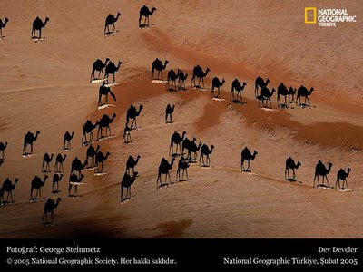
Now let's talk about that photograph.
First of all, I wish I could have gotten it larger on this post.
Those black camel shapes on the sand dunes are huge shadows. The camels casting those shadows are the little light and dark rice shapes at the base of the shadows. Think 'aerial view' with the sun at a slight angle, and you might be able to see how the shadows happened.
Amazing, isn't it?
If you'd like to view a larger pic, contact me with your e-mail address and I'll send it along from the attachment I received today.
[Nice audio surprise on the Bernstein link! A different tune played each time I clicked on it, clicked away, then clicked back. Coooooool.]


2 comments:
I LOVE that picture! Reminds me of one I saw in the Times a while back of ice skaters in Central Park. Here's a ridiculously long link to it if you're curious:
http://www.photoshelter.com/c/laforet/gallery-img-show?G_ID=G0000900vrFkfScU&start=0&pagtotal=85
TOTALLY abfab too cool for school!
I think everyone should copy and paste the ridiculously long link to see the ice skater(s) photo too.
Thanks you, Mr. D!
Post a Comment